Thursday, December 29, 2011

Good Idea: Photo Ledge


A photo ledge is a great way to display artwork or photographs in a flexible way.  You can layer them over each other or leave space in between each piece, depending on how casual or formal you want the display to be.  The best part is that you don't have to worry about where you place the nails for the pictures!

Above photo from www.djimenez.com/.  Interior design by David Jiminez.  More photo ledge examples after the jump...

Friday, December 23, 2011

Color Files: Black and Blue

Saw these recent editorial spreads in French Elle Decor and LOVED the combination of black (matt or shiny) and deep rich blue:


Materials File


I love the blackened steel cladding on the wall surrounding the fireplace.

Project featured in Architectural Digest, Dec 2011.  Design by Atelier AM, photography by Pieter Estersohn.

Good Idea: Shelving

Two nice shelving ideas from the December 2011 issue of Living Etc:


Left: What a nice way to integrate shelving around a bed and doorway.  Photo by Manolo Yllera/Vincent Van Duysen Architects

Right: This (in a tree shape or some other playful shape) would be great for a child's room, or covering entire wall in a study or living room and filled with books and personal treasures and mementos.  Photo by Camera Press.

Susan Weinthaler


In my previous post about the timber-framed home, you can see the above art piece installed in the foyer of the home.  It consists of 2" x 2" squares of varying colors (and perhaps materials, although I can't tell) mounted on a steel canvas with magnets.  The piece is by Susan Weinthaler.  Here's an excerpt from the artist statement on her website:
I have worked with a wide range of materials and treatments, and as such my BITS occupy a space that involves sculpture, painting, and photography that is new is the art world. I am completely taken with the idea of the potentially infinite and am attempting to create an art form that is truly capable of it.
I love that idea, and I love that these artworks are interactive.  You can move the pieces around at will to create different compositions.

All images from www.weinthaler.com.  More images of her work after the jump...

Thursday, December 22, 2011

Instant Attraction: Timber-framed home


This home was featured in Living Etc, Dec 2011.  Images scanned from the magazine.  Styling by Anna Molvik.  Photos by Matthew Williams.

I love that hard materials are mostly natural, rustic, and muted while the super luxurious and often brightly colored soft materials and a few shiny lacquered hard surfaces add just the right contrast.  That staircase is beautiful, and the hammock pulls up and out of the way on a pulley system when the family needs space to entertain.  How cool is that?  

More photos of this home after the jump...

Good Idea: Christmas trees and decorations

It's almost Christmas!  Here are two good twists on the typical christmas tree as seen in the home of Tricia Guild (founder of Designer's Guild) in the Dec 2011 issue of Living Etc.  Both of these ideas could be used year round depending on how you choose to decorate the trees.

Coming soon: a simple keepsake ornament DIY to help you decorate your home.

1.  Indoor tabletop branch tree.  This is a great alternative for someone who lives in a small apartment and doesn't have enough space for a full sized tree, or for someone who doesn't want to clean up needles. 


Another tree variation after the jump...

Wednesday, December 21, 2011

CUSTHOM wall coverings and prints


CUSTHOM is a British design collective that creates a variety of products, including ceramics, textiles, and their standout wallpapers and art prints.  Their CMYK embroidered print is shown above, at left (detail at right). 

Some shots of their lovely wallpapers and another print after the jump...

Tuesday, December 20, 2011

Sourcing: Matthew Hilton chest and tallboy


McQueen tallboy and chest, walnut.  Matthew Hilton for De La Espada.  Images from www.delaespada.com and www.matthewhilton.com

Sourcing: Natuzzi dining table and chairs


Left: Harlem table, walnut
Right: Brera chair, walnut and leather

Both by Natuzzi.  Images from www.us.natuzzi.com

Sourcing: Catchpole & Rye bath tub


Copper bathtub by Catchpole & Rye.  Image from www.crye.co.uk

Sourcing: Ava chair


Sleek injection-molded plastic chairs.  Ava by Song Wen Zhong for Roche Bobois.  Image from www.roche-bobois.com

Sourcing: Sofas

Extrasoft sofa by Piero Lissoni for Living Divani.  Image from http://www.livingdivani.it/


I recently wondered what the difference was between a sofa and a couch.  To me it seems that the terms are used interchangeably, but I assume that at one point there must have been a difference.  I figured that couch must relate somehow to coucher in French, but I had no clue about sofa.  Looking up the etymology of each word I found the following (from http://www.etymonline.com):


sofa Look up sofa at Dictionary.com
1620s, "raised section of a floor, covered with carpets and cushions," from Turk. sofa, from Arabic suffah "bench." Meaning "long stuffed seat for reclining" is recorded from 1717.


couch (n.) Look up couch at Dictionary.com
mid-14c., from O.Fr. couche (12c.) "a bed, lair," from coucher "to lie down," from L. collocare (see couch (v.)). Traditionally, a couch has the head end only raised, and only half a back; a sofa has both ends raised and a full back; a settee is like a sofa but may be without arms; an ottoman has neither back nor arms, nor has a divan, the distinctive feature of which is that it goes against a wall. Couch potato first recorded 1979.


Pretty interesting to see how these words have evolved to the present day, where they essentially mean the same thing.  Whatever you want to call it, there's no denying that the sofa makes or breaks a living room.  Having a comfy place to curl up and watch a movie or read a book is vital for a comfortable home.  I love the Extrasoft by Piero Lissoni (above).  All of the blocks are separate pieces and can be moved around and reconfigured any way you like.

More comfy and stylish sofas after the jump...

Monday, December 19, 2011

Color Files: Bold+Muted


Left: A workspace in the home of Monic Fischer.  Photo by Bruno Suet.
Right: An editorial shot.  Photo by Cora Buttenbender


I saw these photos in the French Elle Decor (Sept 2011) and loved the pairing of bold, bright colors with an otherwise muted palette.  Looking back on previous blog posts, I can see that this combination is something I tend to gravitate toward.  I do love color, but only when used in very specific ways.  There can't be too many different competing colors.  The color should serve as a focal point or to move your eye around the room, not be lost amidst a sea of other competing colors.  There can be a lot of it, or a little of it, but it needs to be done right.

More Bold+Muted interiors after the jump...

Materials file: "Striped" materials


If you look into my closet it will be very clear to you that I like stripes.  I'm not sure why...I don't consciously go looking for striped clothing, I just gravitate towards it for some reason.  It could be that I tend to like crisp and very graphic designs with clearly delineated contrasts.  Whatever the attraction, it definitely carries over into my interior design preferences.  Here are some interiors that feature materials  applied in way that show off a strip-like quality.

Above: City Home Remodel by Garret Cord Werner LLC.  I've been loving pressed concrete lately.  Paired with the green velvet on this sofa and the browns, blacks and whites that make up the rest of this pallette, it is looking pretty fantastic.

More images after the jump...

Sourcing: seating from Tucker Robbins


Tucker Robbins sources furniture and products made by craftsmen around the world.  The catalog definitely has a very global feel.  For me, some of the most standout pieces were stool seating and side tables.  Some of my favorites are shown above.  Images from www.tuckerrobbins.com

1. Dutch chair    2. Rattan basket    3. Wire pouf    4. Hollow cube
5. Porcelain zig zag    6. Hollow zig zag      7. Porcelain mortar

Sourcing: Scientific tableware


I am a complete sucker for anything diagrammatic.  I love biological illustrations, catalogued collections, maps, etc.  

Left: Memento Mori plates by Animal Fabuleux.  I love this take on the very tired skull trend.  I'm so sick of people slapping skulls all over everything.  Thanks to Animal Fabuleux for reconnecting the skull with the rest of the skeleton and rendering it in a more scientific light.  Love, love, love how they've broken each skeleton out over a series of three plates, and that they used two different poses.  Image from www.animal-fabuleux.fr

Right:  Bone china butterfly plates by RE.  These remind me of cases of pinned butterflies.  I like how accurately drawn and un-flowery these butterflies are.  Image from www.re-foundobjects.com

Sourcing: Nanz hardware


Interior designers are required to source every detail of a project, right down to the hardware.  Hinges, lever sets, robe hooks - everything.  This can be overwhelming at first, so it's helpful to have a few good sources in your back pocket.  Above are some examples of beautiful hardware from Nanz.

Images from www.nanz.com

Sourcing: Two modern chandeliers


Left: Crown chandelier by Jehs+Laub for Nemo.  In polished die-cast aluminum.  Love the red cord.  Image from www.nemo.cassina.it
Right: Intersection chandelier by Downtown.  Oil-rubbed bronze.  Image from www.downtown20.net

Sourcing: Conran brindley side table

Conran Brindley side table, for Marks & Spencer. Oak frame with leather strap detail.  I can't tell if the boxes can be moved left/right in relation to one another or if they are fixed into that configuration.  I hope they can move, I love when furniture can be customized to some degree by its user.

Images from www.marksandspencer.com

Sourcing: David Irwin cross side chair


Beautifully crafted stacking chairs by David Irwin.  I love the wool upholstered seat combined with the walnut frame.  Such a clean and simple yet so beautiful.

Images from www.davidirwin.co

Sunday, December 18, 2011

Color Files: Dark background florals

I'm not usually a big florals person, but I do love black background Dutch master floral paintings.  Many florals can be tacky, in my opinion.  Too overtly cheerful or country cottage for my tastes.  But these beauties are moody, dramatic and even a bit somber.  I love the sharp contrast between the brightly colored flowers and the surround and the level of detail in the painting of the flowers.

This area rug evokes some of what I like about these paintings - the drama, the dark background with bright highlights and rich colors.  Ivanovo by Taiping.


Carpet image from www.taipingcarpets.com

Instant Attraction: Isay Weinfeld São Paulo Villa

This villa in São Paulo, designed by Isay Weinfeld, was featured in Architectural Digest Nov 2011 issue.  Photos by Ngoc Minh Ngo.

I love how the architect seems to have excavated out many of the spaces in this project: the stone niche in the living room, the sunken library/sitting area, the staircase, and even the view from the exterior into the dining room gived the impression that the room was dug out of a concrete block.  The use of natural materials and the strip/slat like quality of those materials is also very nice.

More photos of this beautiful project after the jump...

Good Idea: statement necklaces as wall art

I'm loving all of the statement necklaces I've been seeing lately.  They're so gorgeous that you shouldn't have to wait to wear one to show them off.  Showcase them as wall art in your home and hit two birds with one stone.  Here's a great example from Lauren Liess of Pure Style Home:


Some necklaces I wouldn't mind showing off on my wall after the jump...

Instant Attraction: The Home of Amy Butler


The home of Amy Butler was featured in the November 2011 issue of Living Etc.  Photographs by Matthew Williams.  

I LOVE this living room.  So light and airy.  Very crisp and clean, but very homey and bursting with personality.  I love the wide plank wood floors and jute rug and other woven accents throughout.  Those cats really seem to enjoy those large ottoman cubes topped with pillows.  The far wall features one of Amy's wallpaper designs for Graham and Brown.  

A look at Amy's kitchen after the jump...

Friday, December 2, 2011

Instant Attraction: The New Modern (House Beautiful)


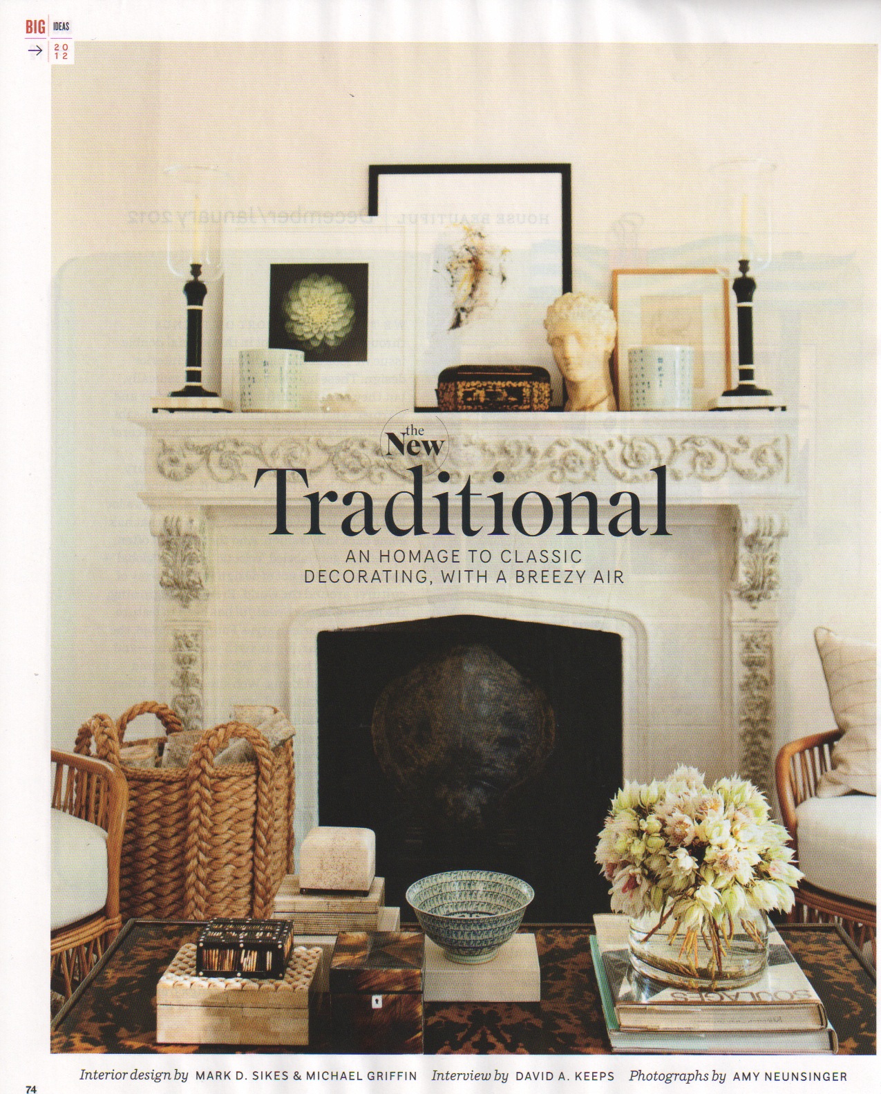
I would move into this home without hesitation and live here happily forever.  It uses my favorite palette: simple, neutral, black, soft whites, and lots of warm, natural tones coming from wood and other natural materials.  This creates a great backdrop for the color accents added by the artwork, objects, and textiles.  I love the casual arrangements scattered throughout the house: framed artwork hung salon style in the dining room, the "organized clutter" of objects on display atop sideboards and tables, and the worn-in collections of pillows upholstered in a smattering of fabrics scattered on that comfy looking sofa.  In fact, pretty much everything in this house gives off an aura of warmth.  The quilts, pillows and rugs all have an extremely handmade quality to them.  And OH!  that kitchen.  The counter seating, the materials used, the open storage displays of tableware, glassware, and spices.  A kitchen is for cooking, it shouldn't look like an operating room.  And this one is perfect.

More after the jump...

De Gourney Fishes handpainted wallpaper.  Photo taken from elledecor.com.  Photo by William Waldron.

Instant Attraction: The New Traditional (House Beautiful)


I believe you shouldn't have to think too hard about design.*  It just takes all the fun out of it.  When you flip through the pages of a magazine or go furniture shopping, listen to your gut.  If you have to look at something and think about whether or not you like it, then you don't really like it that much.  But when you flip to that next page and instantly feel at one with what you're seeing, it's an amazing thing.  That's when you should take the time to look at that image and think about what it is you like.  Why do I just want to jump into this interior and make myself comfortable for a while?  

So with that in mind, I'm going to start taking a closer look at those "gut-feeling" interiors and taking some time to analyze what it is that makes them so appealing.  

The first images I'm going to share are from House Beautiful Dec/Jan 2012, "The New Traditional."  Interior design by Mark D. Sikes & Michael Griffin.  Photos by Amy Neunsinger.

*This is not to say that one doesn't need to put a lot of thought and consideration into creating a good design.  In fact, each piece of furniture, material, artwork, or object that is chosen needs to have a reason for being there.  

More after the jump...

Skultuna

Skultuna is a Swedish firm that produced high quality silver and brass objects.  Here is one object that I am definitely coveting:


Belle brass jewelry holder.  It's only a matter of time until my wedding ring gets stolen in the night by my cat.  This would help to keep it safe.  The top part also comes off to store other small objects inside.  Designed by Claesson Koivisto Rune.

I poked around their website for a bit and discovered that they produce lots of great gift-worthy items.  A couple of standouts after the jump...

Ibride


After seeing this fantastic, transformers-like urn/serving set in House Beautiful I moseyed on over to the website of Ibride, a design firm that creates amazing and quirky furniture and accessories.  Their pieces are odd in the best possible way.  More treasures after the jump...

Kismet Tile


From their website:

 is Moroccan-made cement tile crafted according to traditional materials and methods but with bold, modern motifs which highlight the beauty, materiality, and geometric harmonies of these classic tiles.


I love the faded look of these cement tiles, especially the grey-scale ones.

Image scanned from House Beautiful Dec/Jan 2012.http://www.kismettile.com/