
I believe you shouldn't have to think too hard about design.* It just takes all the fun out of it. When you flip through the pages of a magazine or go furniture shopping, listen to your gut. If you have to look at something and think about whether or not you like it, then you don't really like it that much. But when you flip to that next page and instantly feel at one with what you're seeing, it's an amazing thing. That's when you should take the time to look at that image and think about what it is you like. Why do I just want to jump into this interior and make myself comfortable for a while?
So with that in mind, I'm going to start taking a closer look at those "gut-feeling" interiors and taking some time to analyze what it is that makes them so appealing.
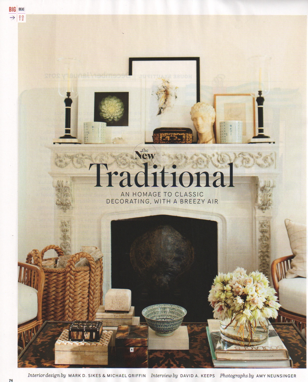
The first images I'm going to share are from House Beautiful Dec/Jan 2012, "The New Traditional." Interior design by Mark D. Sikes & Michael Griffin. Photos by Amy Neunsinger.
*This is not to say that one doesn't need to put a lot of thought and consideration into creating a good design. In fact, each piece of furniture, material, artwork, or object that is chosen needs to have a reason for being there.
More after the jump...
I love everything about the above scene. The palette is so simple and subtle, but there is still so much personality in here. The cane frames of the chairs and that gorgeous, chunky woven basket act as color accents. The vignettes on the coffee table and mantle are quite full, but don't feel cluttered. They add a story to the room and (I assume) tell us something about the people who live there. Maybe they're travelers who collected these items from places near and far. Maybe they just went to Flair and bought a bunch of classy snuff boxes. Who knows, but the fact that it makes you curious is what counts.

My favorite palette again. Black, white, beige! Hard and soft natural materials! Shiny! Light! Mirrors! And look, more fancy snuff boxes! Whew. I love the way the artworks are leaned against the wall rather than hung. It makes the room feel casual. The glossy black paint on that woodwork is perfection. The fact that the sink is open underneath makes the room feel lighter. Cabinetry underneath would have ruined this. I also love the sconces being mounted on the mirror. I would like to take an evening bubble bath with the low light of those lamps and a good book in that claw foot tub (fine, I can't see that it's a claw foot, but that's what it is in my imagination - isn't it illegal not to have a claw foot tub underneath an oval shower curtain rod?).
No comments:
Post a Comment